Small pieces, a shared language.
The typography, colors, and interactive components used in the articles. This page is also their workshop.
Typography and color
Inter for text, Fira Code for code, and Departure Mono for dates and small labels. Light and dark themes share the same color system.
Learn, experiment, share.
A good interface lets the content speak.
const curiosity = true It all starts with a little curiosity.
Article components
Keeping notes, explanations, and references distinct makes long articles easier to read. [1]
A little more detail
This section uses native HTML. Its explanation remains accessible without JavaScript.
Start with a clear question.
Then make a small, reproducible experiment.
Finally, a result that shows what we learned.
One useful way to understand a concept is to turn it into a small example.
Images
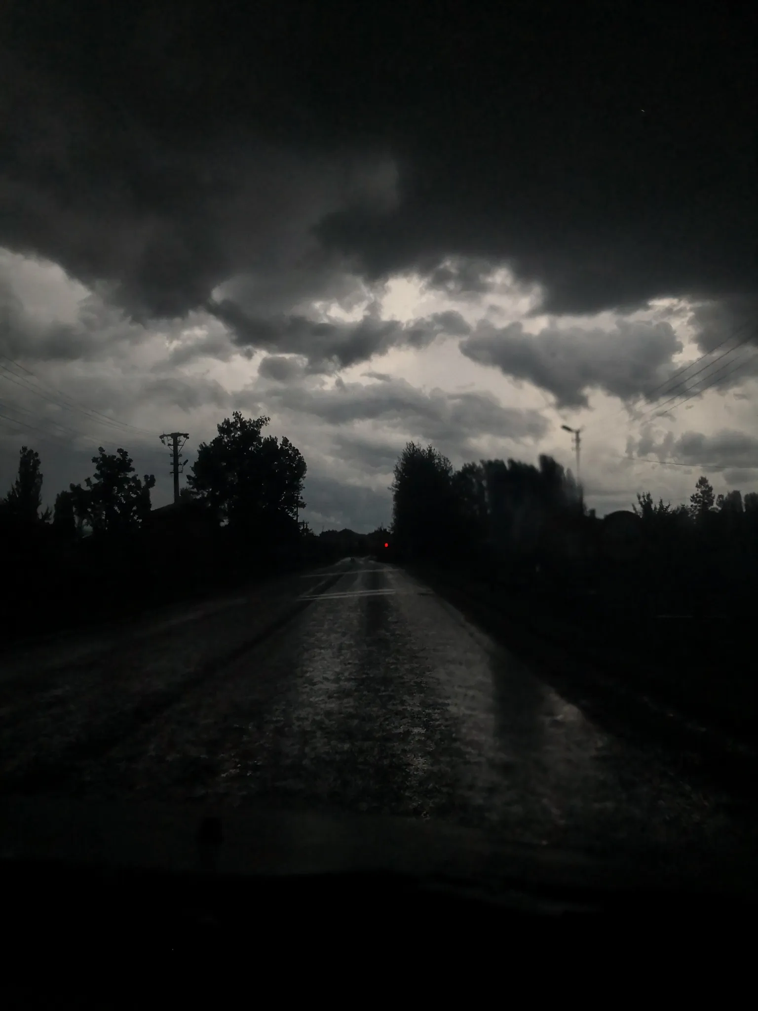
Enlarge images and browse with the arrow keys. The slideshow also supports touch gestures.


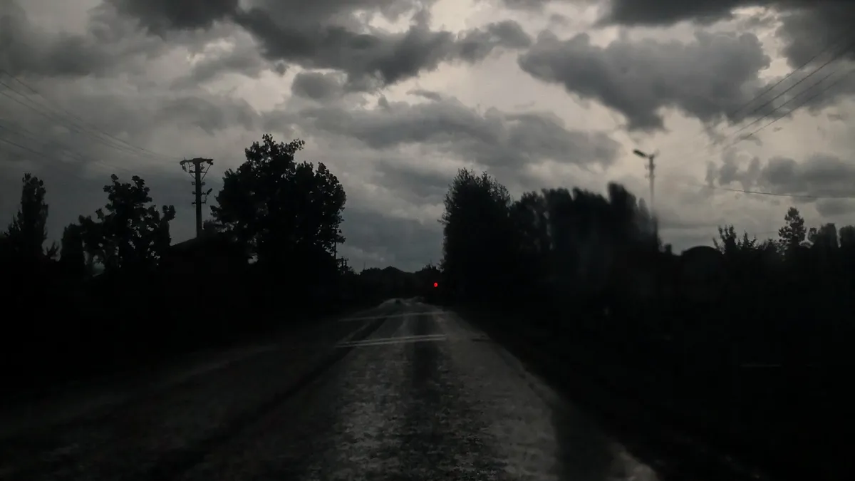

Side-by-side comparison
Single image
Interaction and code
Shared controls for small experiments in articles. Try changing the size and shape below.
The code runs only in the isolated preview on this page. Network access, access to the parent page, and package installation are disabled.
- These components can be used in new MDX content without changing existing articles. ↩
The visual language and blog experience were adapted from Maxime Heckel’s blog to Astro. The content, photographs, and identity belong to this site.